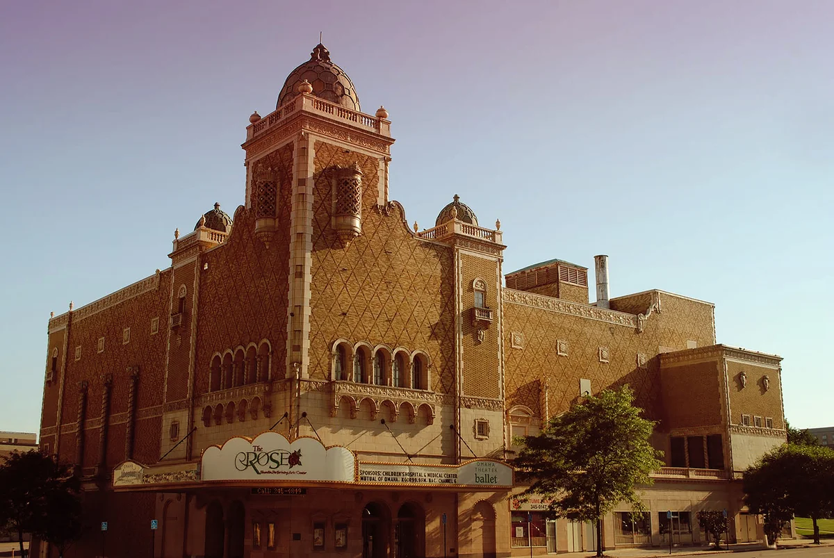
Color Palettes for Historic Buildings in Tampa
Selecting historically accurate and aesthetically appropriate colors for Tampa's landmark buildings—from Victorian polychromy to Mediterranean Revival earth tones.
Color profoundly affects how we perceive historic buildings. A carefully chosen palette enhances architectural details, expresses building character, and contributes to neighborhood harmony. Conversely, inappropriate colors can diminish even the finest architecture, compromise historic district character, and potentially disqualify projects from tax credit eligibility. Understanding period-appropriate color selection for Tampa's diverse historic building stock enables informed decisions that enhance preservation outcomes.
Florida Construction Specialists provides color consultation as part of comprehensive historic restoration services. Our approach combines paint analysis of existing finishes, research into period color conventions, and coordination with historic district guidelines to develop palettes that are both historically appropriate and aesthetically successful.
Paint Analysis: Discovering Original Colors
Scientific paint analysis provides the most reliable method for determining original building colors. Microscopic examination of paint cross-sections reveals the sequence of paint layers applied over a building's lifetime, enabling identification of original finishes beneath accumulated later coatings.
Paint samples should be taken from protected areas where original finishes are most likely to survive—under porch roofs, in recessed panels, behind shutters, or under hardware. Multiple samples from different building elements establish the complete original color scheme, identifying how body, trim, sash, and accent colors related to each other.
For tax credit projects, paint analysis provides documentation supporting color selections in Part 2 applications. National Park Service reviewers expect color decisions to be based on evidence rather than assumptions. Analysis costs ($300-$600 per sample) represent modest investment compared to the documentation value provided.
Color Conventions by Architectural Style
Different architectural periods employed distinct color approaches that should guide palette selection for buildings of each era. Understanding these conventions helps identify appropriate options even when original colors cannot be determined through analysis.
Victorian-era buildings (1870s-1900) often featured elaborate polychromatic schemes with multiple contrasting colors highlighting different architectural elements. Rich, saturated colors—deep reds, greens, browns, and creams—were common. Decorative trim might receive accent colors that differ from both body and primary trim, creating complex visual compositions that emphasized ornamental details.
Colonial Revival buildings (1890s-1940s) typically employed more restrained palettes reflecting their classical inspiration. White, cream, and pale gray bodies with white or contrasting dark trim characterized the style. Shutters in dark green, black, or dark blue provided accent. The overall effect emphasized dignity and formality rather than exuberance.
Mediterranean Revival buildings (1920s-1940s), common throughout Tampa, drew on Spanish Colonial precedents with warm earth tones—terra cotta, sand, cream, and coral—that complemented clay tile roofs. Decorative elements might receive deeper versions of body colors or contrasting accents in turquoise, deep blue, or warm brown.
Typical Color Approaches by Architectural Style
| Style | Body Colors | Trim Colors | Accents |
|---|---|---|---|
| Victorian | Rich earth tones, saturated colors | Contrasting, multiple colors | Bright accents on details |
| Colonial Revival | White, cream, pale gray | White or dark contrast | Dark shutters (green, black) |
| Mediterranean Revival | Terra cotta, sand, cream, coral | Deeper or lighter body tones | Turquoise, deep blue, warm brown |
| Craftsman | Warm browns, greens, russet | Lighter or darker body tones | Natural wood stains, earthy accents |
| Commercial/Industrial | Natural brick, painted neutral | Compatible with body | Minimal; emphasis on signage |
Historic District Color Guidelines
Tampa's historic districts maintain guidelines that govern exterior colors for buildings within their boundaries. Color changes in locally-designated historic districts typically require Certificate of Appropriateness approval, with review boards evaluating whether proposed colors are appropriate for the building's style and compatible with neighborhood character.
Ybor City's Barrio Latino Commission reviews color proposals for buildings within the National Historic Landmark District. The district's distinctive character—with its brick industrial buildings and colorful commercial facades—informs color decisions that maintain authentic neighborhood appearance while allowing individual building expression.
Hyde Park and other residential historic districts emphasize neighborhood harmony alongside individual building authenticity. Colors that might be appropriate for an isolated building could be problematic if they clash with neighboring properties. Review considers both building-specific appropriateness and contextual compatibility.
Commercial Building Color Considerations
Historic commercial buildings present distinct color challenges. Storefronts must serve business identification purposes while maintaining historic character. Upper facades may have different treatment than street-level commercial spaces. Brick buildings—common in Ybor City and downtown Tampa—raise questions about whether painting unpainted brick is appropriate.
Generally, painting previously unpainted historic masonry is discouraged under the Secretary of the Interior's Standards. Brick that has never been painted should usually remain unpainted. However, brick that was painted historically may be appropriately repainted with compatible colors. Paint analysis can determine whether masonry was originally painted.
Commercial signage colors interact with building colors and should be considered together. Sign colors that complement building palette contribute to overall appearance, while clashing sign colors can undermine otherwise appropriate building treatment. Historic district sign guidelines often address color along with size and materials.
Tax Credit Implications of Color Selection
The Secretary of the Interior's Standards require that "the historic character of a property shall be retained and preserved." Inappropriate color selection can compromise this standard, potentially affecting tax credit certification. While color alone rarely causes credit denial, it contributes to overall assessment of whether rehabilitation preserves historic character.
Part 2 applications should describe proposed colors and explain how they are appropriate for the building. References to paint analysis, historic documentation, or style-appropriate conventions strengthen applications. Proposing colors dramatically different from documented originals or period norms requires justification that may face skeptical review.
Florida Construction Specialists develops color specifications for tax credit projects that satisfy NPS expectations while achieving owners' aesthetic objectives. Our experience with successful tax credit applications informs color recommendations that protect credit eligibility.
Tampa's Historic Districts: Neighborhood Color Character
Ybor City National Historic Landmark District
Ybor City's distinctive color palette reflects its Cuban, Spanish, and Italian immigrant heritage. The district's industrial brick cigar factories provide a neutral backdrop against which residential and commercial buildings display warm, inviting colors. Traditional Caribbean and Mediterranean color schemes—coral, yellow, turquoise, and terra cotta—appear throughout the district, creating visual warmth that complements the subtropical climate.
The Sanchez y Haya Building (1910) exemplifies appropriate color treatment for industrial structures, with its natural brick facade enhanced by carefully selected trim colors that emphasize architectural details without overwhelming the masonry. Social clubs like the Italian Club and Centro Español demonstrate formal color approaches suitable for institutional buildings—dignified palettes that convey civic importance while respecting architectural character.
Ybor City's shotgun houses and casitas traditionally employed bright, cheerful colors that expressed individual family identity within the cohesive neighborhood fabric. Paint analysis on these modest structures often reveals surprisingly sophisticated original color schemes that balanced economy with aesthetic appeal. Common combinations included yellow bodies with white trim and green shutters, or coral bodies with darker coral trim and turquoise accents.
Hyde Park Historic District
Hyde Park's residential character demands color palettes that enhance individual building beauty while contributing to neighborhood harmony. The district's tree-lined streets and varied architectural styles—from Queen Anne Victorians to Colonial Revival cottages—create a cohesive environment through compatible color relationships rather than uniformity.
Victorian homes in Hyde Park traditionally displayed complex polychromatic schemes that highlighted their elaborate ornamental details. A typical three-color Victorian palette might feature a warm gray body, white trim, and dark green accents on shutters and decorative elements. More elaborate schemes added fourth and fifth colors for spindle work, brackets, and other decorative features.
Colonial Revival houses in Hyde Park typically employed more restrained palettes reflecting their classical inspiration. White, cream, and pale gray dominated body colors, with white trim providing crisp definition. Dark shutters in forest green, navy blue, or black added sophistication. These restrained palettes complemented the district's mature landscape, allowing architecture and gardens to work together harmoniously.
South Tampa Historic Properties
South Tampa's Mediterranean Revival mansions and Craftsman bungalows reflect the prosperity and sophistication of early 20th-century development. Color palettes in these neighborhoods emphasize harmony with natural materials—stucco, stone, and clay tile—while respecting individual architectural character.
Bayshore Boulevard's historic mansions demonstrate appropriate color treatment for high-style Mediterranean Revival architecture. Warm earth tones—sand, cream, terra cotta, and coral—complement red clay tile roofs while providing sophisticated backdrops for ornamental details. Trim colors typically derive from the same color family as body colors, creating subtle tonal variations rather than sharp contrasts.
Paint Technology and Historic Buildings
Understanding paint technology helps inform appropriate material selection for historic building restoration. Lead-based paints, used extensively until 1978, created durable finishes but present health concerns during removal. Modern paint formulations offer improved performance while maintaining compatibility with historic substrates.
Latex paints work well on most historic surfaces and provide excellent durability in Florida's challenging climate. For previously oil-painted surfaces, proper surface preparation and appropriate priming enable successful latex application. Some specialized applications—decorative finishes, metalwork coatings, or high-moisture environments—may require specific formulations.
Paint failure on historic buildings often results from moisture infiltration, incompatible paint systems, or inadequate surface preparation rather than paint quality. Addressing underlying moisture problems, removing failed coatings completely, and applying compatible primer systems prevents premature failure and preserves color appearance.
Color Documentation and Research Resources
Proper color documentation supports both preservation goals and regulatory compliance. For tax credit projects, Part 2 applications should include color specifications with explanations of how selections are appropriate for the building and period. Historic district applications similarly benefit from documented justification for color choices.
Paint manufacturers' historic color collections provide convenient starting points for period-appropriate selection. Sherwin Williams' Historic Collection, Benjamin Moore's Historical Collection, and Dunn-Edwards' Historic Colors offer extensive palettes based on documented original colors from significant buildings. These collections organize colors by period and style, simplifying selection.
The National Park Service's Preservation Brief #28: Painting Historic Interiors provides technical guidance for interior color work, while Brief #10: Exterior Paint Problems on Historic Woodwork addresses technical aspects of exterior painting. The Association for Preservation Technology publishes research on paint analysis techniques and historic color studies.
Specialized Color Applications in Historic Buildings
Interior Historic Colors
Interior colors in historic buildings reflected both period conventions and individual taste. Formal rooms often employed richer, darker colors—burgundy, forest green, or deep blue—while service areas received lighter, more practical colors. Woodwork might be painted, grained to simulate expensive woods, or left natural depending on wood quality and room formality.
Paint analysis of interior surfaces can reveal sophisticated decorative schemes—stenciled borders, faux finishes, or elaborate ceiling treatments. Some historic buildings retained professional decorative artists whose work represents significant artistic heritage. Documentation and preservation of these decorative schemes may be required for tax credit projects.
Metal Elements and Architectural Hardware
Historic metal elements—cast iron, wrought iron, steel, and bronze—require specialized color treatment. Many metal building elements were originally painted to prevent corrosion, while others were left natural or received protective coatings that enhanced natural metal appearance.
Cast iron elements common in Ybor City's commercial buildings were typically painted in colors that coordinated with overall building schemes. Dark colors—black, dark green, or bronze—provided practical benefits by hiding dirt and wear while offering sophisticated appearance. Some decorative cast iron received polychromatic treatment highlighting ornamental details.
Color Selection Process and Professional Services
Successful color selection for historic buildings follows a structured process that balances preservation requirements with aesthetic objectives. Florida Construction Specialists guides clients through each step, ensuring selections satisfy both preservation standards and individual preferences.
Initial assessment examines existing conditions, architectural style, and regulatory context. Paint analysis determines original colors when feasible, while style research identifies appropriate alternatives when analysis is inconclusive. Neighborhood context analysis ensures compatibility with district character and neighboring properties.
Mock-ups and samples provide opportunities to evaluate color selections under different lighting conditions before final application. Large test patches reveal how colors appear on the actual building surface, accounting for texture, lighting, and viewing distance effects that small samples cannot convey.
Case Study: Historic Ybor City Cigar Factory Restoration
When Florida Construction Specialists restored the historic Perfecto Garcia Cigar Factory in Ybor City, color selection required balancing industrial authenticity with contemporary commercial needs. Paint analysis revealed that the building's brick exterior was never painted, while window sash and doors originally received dark green paint that complemented the natural brick.
The restoration preserved the natural brick appearance while restoring original dark green trim colors. Interior analysis revealed cream-colored walls in office areas and natural wood finishes in manufacturing spaces. The completed project earned recognition from the Barrio Latino Commission and qualified for federal historic tax credits.
This project demonstrates how thorough color research supports both preservation goals and regulatory approval while achieving commercial viability for adaptive reuse.
Regional Climate Considerations for Historic Paint
Florida's subtropical climate presents unique challenges for exterior paint durability. High humidity, intense UV radiation, salt air exposure (in coastal areas), and severe weather events affect paint performance and longevity. Color selection must consider these factors alongside preservation requirements.
Light colors reflect heat and UV radiation, potentially extending paint life compared to dark colors that absorb heat. However, preservation standards may require specific colors regardless of performance considerations. High-quality paints with UV inhibitors and mildew resistance provide better durability in Florida's challenging environment.
Hurricane preparedness affects exterior finish selection. Impact-resistant windows and doors may receive protective films that alter color appearance. Temporary protective measures—plywood panels, hurricane shutters—should coordinate with building colors to minimize visual impact during extended deployment periods.
Cost Factors in Historic Paint Projects
Historic building paint projects typically cost 25-50% more than standard commercial repainting due to specialized preparation requirements, premium materials, and skilled labor needs. Cost factors include lead paint abatement, extensive surface preparation, specialized primer systems, and multi-coat applications.
Typical Exterior Paint Project Costs
| Project Component | Cost per Square Foot | Notes |
|---|---|---|
| Standard Exterior Painting | $3 - $6 | Modern building, minimal preparation |
| Historic Building (No Lead) | $5 - $10 | Detailed prep, specialty materials |
| Lead Paint Abatement | $8 - $15 | EPA RRP compliance, containment |
| Complex Multi-Color Scheme | $7 - $14 | Victorian-era polychromatic schemes |
| Paint Analysis & Consultation | $300 - $600 per sample | Laboratory analysis, color matching |
Federal historic tax credits can offset 20% of qualified rehabilitation expenditures, including appropriate paint work. State and local incentives may provide additional benefits. The improved durability and enhanced property value from professional historic paint restoration often justify the initial investment.
Maintenance and Long-Term Color Preservation
Maintaining historic color schemes requires ongoing attention to environmental factors that cause fading, chalking, and other deterioration. Regular inspection identifies problems early when correction is less expensive than wholesale repainting.
Documented color formulations enable accurate matching when touch-up or partial repainting becomes necessary. Keeping paint samples, color specifications, and application records ensures consistency across maintenance cycles. Digital photography under controlled lighting conditions provides additional documentation.
Preventive maintenance—cleaning gutters, repairing caulking, addressing moisture sources—protects paint systems and extends service life. Many paint failures result from building maintenance issues rather than paint quality, making comprehensive building care essential for color preservation.
Frequently Asked Questions About Historic Building Colors
Do I have to use the exact original colors?
Not necessarily. While original colors represent one appropriate option, period-appropriate alternatives may also be acceptable. The Secretary of Interior's Standards require colors compatible with historic character, not exact replication. For tax credit projects, documented justification for color choices—whether based on analysis or period conventions—supports approval.
Can I paint a previously unpainted brick building?
Generally no. Painting previously unpainted historic masonry is discouraged under the Secretary of Interior's Standards and would typically be rejected in historic district review. If brick was historically painted, repainting with appropriate colors is generally acceptable. Paint analysis can determine whether masonry was originally painted and guide appropriate treatment.
How do I choose colors if I can't determine originals through analysis?
When analysis doesn't reveal original colors, research into period color conventions for your building's style and era provides guidance. Published historic color collections from paint manufacturers offer period-appropriate options. Local historic district staff may have recommendations based on similar buildings. Consulting with preservation professionals helps identify appropriate alternatives.
What paint types are most appropriate for Florida's climate?
High-quality 100% acrylic latex paints perform well in Florida's subtropical environment. Look for formulations with UV inhibitors, mildew resistance, and good color retention. For previously oil-painted surfaces, proper preparation and alkyd primer enable successful latex topcoat application. Specialized coatings may be required for metal elements or high-moisture areas.
How many colors should a historic building have?
The number depends on architectural style and period. Victorian buildings often used three or more colors highlighting different elements. Colonial Revival typically used two colors (body and trim) plus shutters. Mediterranean Revival might use one or two main colors with subtle accents. Craftsman buildings often employed natural material colors with minimal painted surfaces. Research your building's style to understand appropriate complexity.
How do I handle lead paint on my historic building?
Lead paint on buildings built before 1978 requires EPA RRP (Renovation, Repair, and Painting) certified contractors and specific work practices. Florida Construction Specialists maintains EPA RRP certification and follows required protocols for safe lead paint management. Costs are higher but necessary for compliance and safety. Some lead paint may be encapsulated rather than removed, depending on surface conditions and project scope.
What documentation do I need for historic district approval?
Most historic districts require Certificate of Appropriateness applications for exterior color changes. Include color specifications (manufacturer, color name/number), photographs showing existing conditions, and explanations of how proposed colors are appropriate for the building style and district character. Paint analysis reports, historical documentation, or references to period color conventions strengthen applications.
Can I use modern color trends on my historic building?
Modern trends should generally be avoided in favor of period-appropriate colors. Historic district review and tax credit standards emphasize compatibility with historic character rather than contemporary fashion. However, some modern colors may happen to be similar to historic colors. The key is justifying color choices based on historical appropriateness rather than current trends.
Expert Color Guidance from Florida Construction Specialists
Florida Construction Specialists provides comprehensive color consultation for historic restoration projects throughout Tampa Bay. Our approach combines analytical methods, historical research, and aesthetic judgment to develop palettes that enhance building character while satisfying preservation requirements.
Contact us today to discuss color selection for your historic building. We'll help you navigate the options, satisfy regulatory requirements, and achieve a result that honors your building's heritage while meeting your aesthetic objectives.
Explore Our Historic Restoration Services
Ready to Start Your Commercial Project?
Contact Florida Construction Specialists for expert commercial construction services across Tampa Bay. From design-build to tenant improvements, our team delivers quality results on time and on budget.